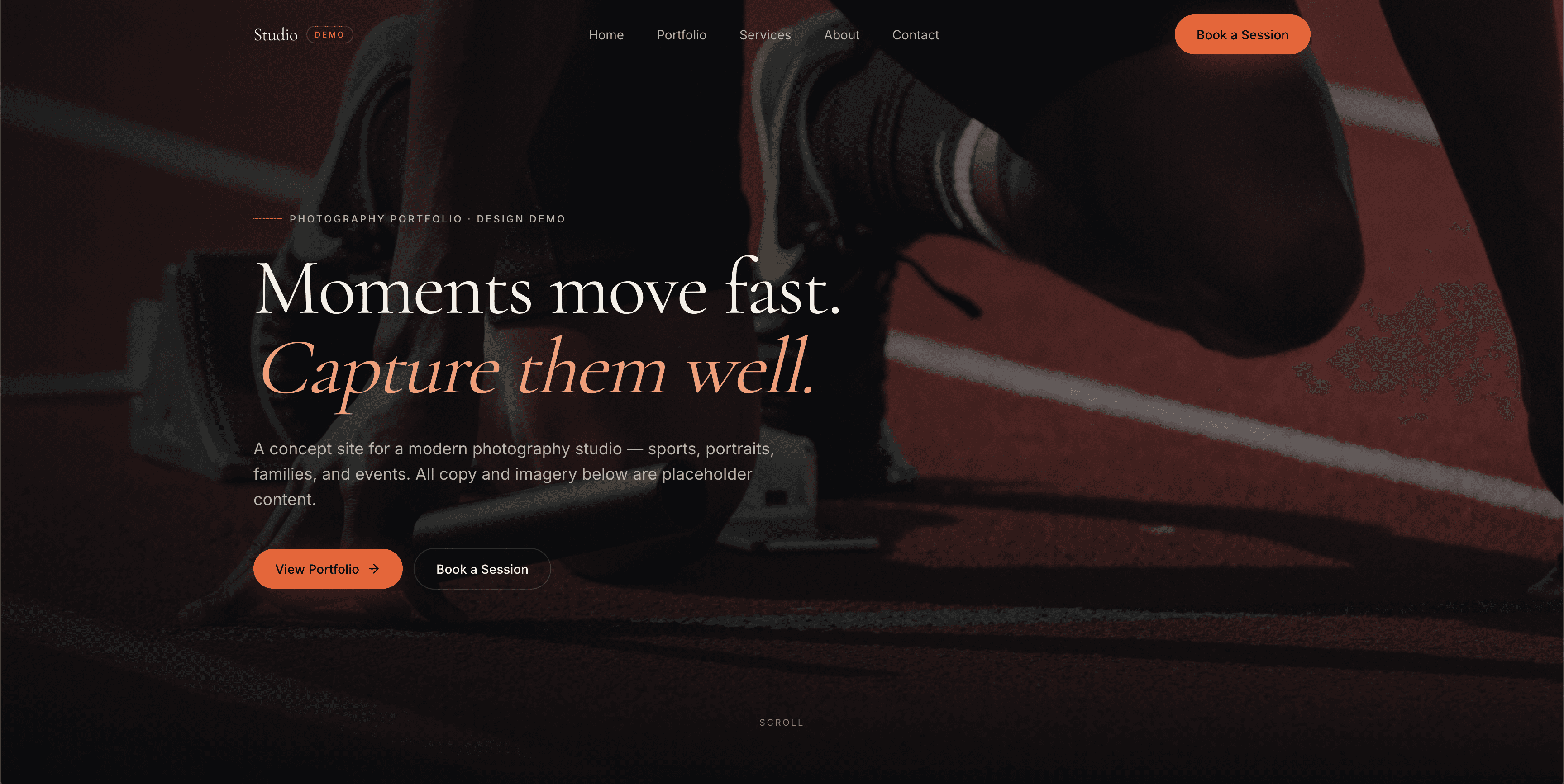
The Challenge
Modern photographers often lose bookings to sites that feel dated or generic: grids of thumbnails with no story, no editorial feel, and no clear path to inquire. A photography studio needs a portfolio that reads like a magazine, not a proof gallery.
The Solution
Designed a cinematic, editorial concept site with a full-bleed hero, asymmetric featured work grid, three category cards, service packages, and a booking-focused CTA. Typography pairs Cormorant Garamond with Inter for a modern editorial feel, and the ember accent color gives the dark palette warmth without competing with the imagery.
The Result
A concept portfolio that positions a photographer as a premium creative: every section is built around the imagery, with clear paths from browsing to booking a session. Ready to be re-skinned with a real photographer's brand, work, and contact details.
Key Improvements
Want results like this for your business?
Tell me about your project. I'll send back a clear plan, a fixed price, and a realistic timeline within one business day.
Start your projectSee all work